René Magritte Surreal World Edit
- Laks

- Oct 15, 2020
- 4 min read

Inspired by René Magritte's idea of surrealism linked into reality in his work, I decided to play around with photoshopping my own versions mixing the two together.
to test my ideas and editing methods I first decided to practice on a photo that had already been taken by somebody on Google, so that I could fully focus on how I was going to edit my photos.

Here is the original photo before editing.
When looking at this photo I noticed that I had to consider many different details when I was going to change the background to make the editing look more realistic and effective.
First, I had to erase the background of the window so that the sea background was no longer present. To do this, I used the 'Quick selection tool' on photoshop to completely select the middle area. I then used the eraser to make the edges look clean, so that when the background was inserted, it wouldn't look blocky. This was tricky as it took patience, but after taking the time to zoom in and erase all the little parts, I was ready to add the background I had chosen in.

For my surreal background, I wanted to go for a space theme to play on the idea of a dreamy-like world compared to reality.
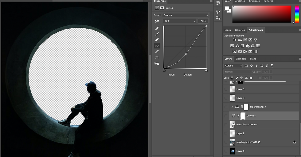
Now that I had both of my images, I started to think about how I can make the colours on both of the photos match, so that it did not look like it had just been edited in. I also thought about lighting, and how if the background was actually this setting, how the shadows and light would reflect onto the windowsill and person in the original photo. To do this, I used the 'Curves' tool on photoshop to play around with the lighting of the galaxy photo to try and start to match it up with the same types of tones that are shown in the window photo.

After I had completed this, I decided that I wanted to add more to the background to Bring more attention to it. I thought about what other elements of space that I could add. I decided to add planets and the moon.
To do this, I got an image of the moon and used the quick selection tool to cut it out so that it had no background. I then placed the moon where I wanted on the photo, making sure the moon layer was under the layer with the window photo on it. Once I had placed the moon where I wanted it to go, I noticed that the moon looked flat on the image as there was no lighting around it. I created a new layer under the moon and used a soft brush to outline the moon to create a white glow. I then used the 'gaussian blur' filter to make the brush strokes look more blurred and highlight like. This was an effective tool as it made the moon look 3D and more in place. I then created more highlights on the window in the opposite direction as realistically, if the moon was there the light would reflect onto the windowsill. I then started to add more highlights around the man and in other places around the window to create different shadows and highlights. I then added a clipping mask to the sky and moon layer and used the 'colour balance' tool to combine the colours of the sky and moon together to make it look more natural.

After I had completed adding the moon in, I then proceeded to do the same with another planet, using the same technique. though, instead of using white highlights, I used a yellow found in the planet to create a more natural glow. I used the gaussian blur tool again to create highlights around the window and the person. I also added a clipping mask to the cut out planet and made the planet darker to make it fit in more with the sky so that it didn't fade into the background as much.


I then did this technique one more time but with a different planet, but this time making sure to use red highlights instead of white or yellow as the planet is red. I then added red highlights around the man and the windowsill to create a more realistic effect.

Now that I had added all of the planets, I wanted to make sure that all the colours in the background mix so that the planets do not look like they have just been pasted in. to do this, I played around with the curve and colour balance of the overall photo. I made sure to lighten parts and darken others.
Finally, to bring the whole image together, I placed a gradient map over all of the layers to combine the colours of the two photos together to create an overall matching tone. I did this twice, making sure to turn down the opacity of the layer so that the colour mix wasn't overwhelming as it creates block colours. By doing this, It created an overall filter combining the two sides
of colours together. I did this twice to get the final result that I wanted.
Overall, I am extremely pleased with the result of this photo and I feel confident with my editing throughout the image. If I was to change anything, I feel that I could have possibly created more lighting on the window.
From this experiment, I decided to create an other edit, but this time, using my own photo.
To get the right photo for the edit that I wanted to do I made sure to place my model outside, near the sky so that I could edit it out to create a surreal world. I made sure to have my subject placed somewhere in the frame that was not directly in the middle to play on 'the rule of thirds'

I used the same technique that I used to create the photo shown before, making sure to gradient map my image to blend all the parts together as well as making sure to highlight parts throughout the photo to create dynamic and a sense of reality instead of just pasting two photos next to each other. I also wanted to create a fun element to an edit so I added cartoon characters, playing on the whole realism vs surrealism idea, as people like to escape through cartoons as it takes them into a different world, Pokemon being a great example.


Comments