Poster practice
- Laks

- Jan 23, 2020
- 3 min read
Updated: Feb 1, 2020

For the task given today we started to think about different methods that are used when creating posters and also how to create posters fitted to certain criteria.
To do this, we were given a type of font, a topic, a colour scheme and a style at random and then we had to create a poster fitted to that criteria in 20 minutes.
For my first example I had to use the font 'comic sans' with the style 'punk' and the colour scheme being oranges and blacks. I had to make this poster on the topic of war. This found to be extremely challenging as Comic sans does not go hand in hand with the idea of 'war'. This challenge helped me to see the reality of having to create work based on what is asked more than what you like in buisness

which was very benificial to me as I now see how I present and create my work in a different light. Whilst creating this poster I also had the opportunity to learn more skills within photoshop which I can use in the future, such as how to colour in certain points without the paint brush and also how to create a filtered photo on top of a different image to create an effect, which is presented within the poster created.
Overall, I feel that I could have done better with this poster but reguarding the time that I had to create it and also having to use certain elements that didn't exactly go, I feel that the poster turned out better than expected.
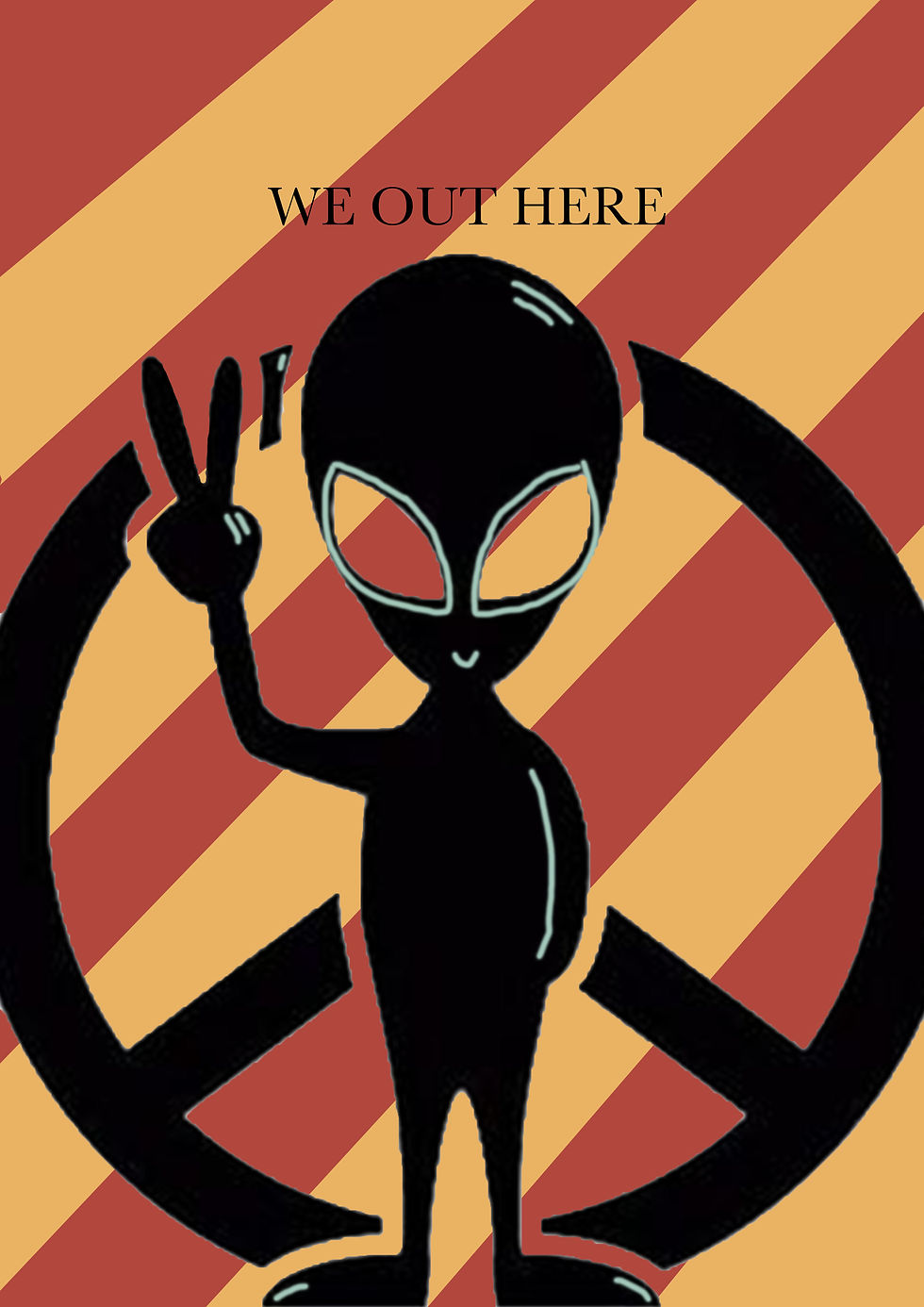
The Next poster that I had to create consisted of a cartoon theme about space with the colours red and orange. For this poster, I decided to play around with aliens as that is my signiture art piece. I wanted this poster to be simple and have a short message. This poster was easy to make and did not take me the full time that I was given. I like the style I have used as it is simple and easy to recognise. Whilst creating this poster I learned easier ways to create backgrounds compared to how I was making them before, which is very benificial. I prefer this poster to the first one I made as I could add more of my own style into the poster compared to the first one.
For my third and final poster we had to create a minimal poster using the colour scheme of yellow and black about 'bands' straight away my mind was drawn to ;the stone roses' due to their recognisable yellow lemon symbol. This poster was extremely easy to make and did not take long as all but I feel that this poster is the more effective out of the three, showing that you do not need to add loads of elements into a poster to make it effective, as long as you can clearly see what the poster is trying to portray it doesnt matter how much is on the poster. I feel that out of the three the stone roses poster is my favourite and the most professional as it is extremely clean and clear but also creatively put together.
Overall, I feel that the task that I did has extremely helped me to think about how to present my poster in an effective way, being a minimal approach. It also has made me think a lot about objective and criteria when creating a piece of work and has given me ideas on different text and colour scheme which would be affective when creating my final propaganda poster.


Comments