FMP - Graphic design Rave flyers response
- Laks

- Jun 1, 2021
- 5 min read
Updated: Jun 2, 2021
Inspired by the Rave poster by 'Rage' made in 1989, I decided that I wanted to try and re create my own poster in the same type of style. I did not want to copy the flyer completely, but I wanted there to be a clear connection between the two to tell that I was inspired by the poster.


My first challenge that I faced was trying to figure out how I was actually going to make this poster. I had to identify each part and figure out how this would have been made. Obviously, as it was made in the late 80s, I was aware that technology was not as advanced as it is now, suggesting that other methods were used to make this poster instead of solely using photoshop, such as scanning in pieces of paper and layering images up, But unfortunately, due to lack of time, I was not able to experiment with this method. Instead, I took to photoshop to consider different layering I could digitally.
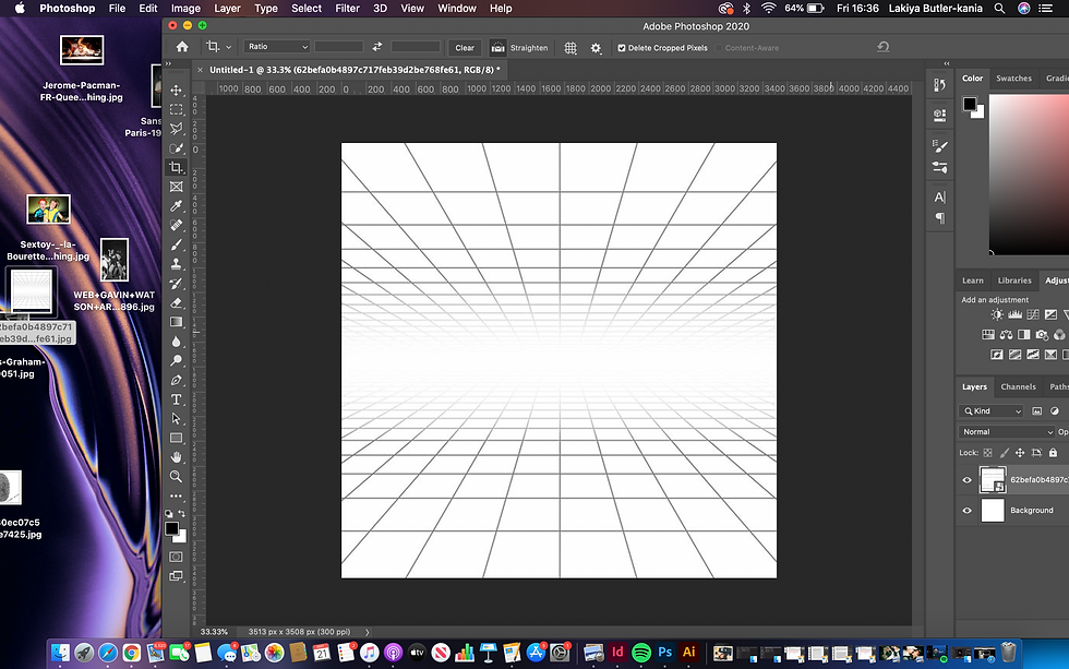
My first step was to get a grid. I did not want to get the exact same type as the one in the image I was inspired by, but I wanted to pick a grid that would be able to show distance, and that the planets will be doing back. I found this grid off Pinterest and decided it best fitted what I wanted to achieve.
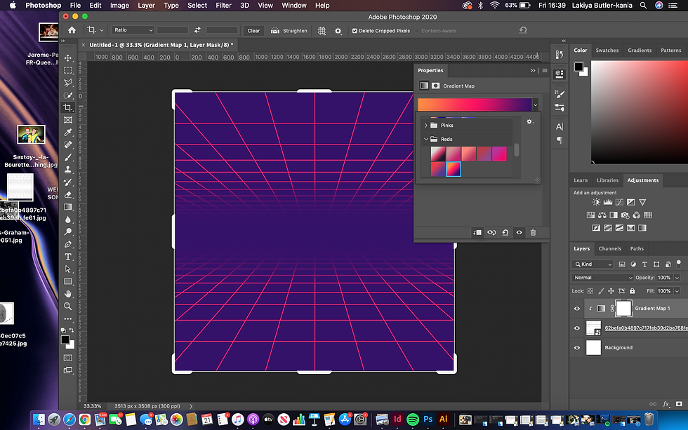
After adding a grid in, I started to experiment with different gradient maps over the top, making sure to create a clipping mask onto the layer. I decided to chose this gradient map as I felt like it gave a great retro feel. I Also liked how it made the lines stand out.
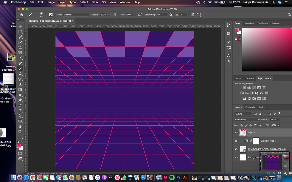
Next, I started to colour in blocks at the top of the grid, just like in the inspired piece. To make sure that I was accurate with what I was colouring in, I used the polygonal lasso tool to select the areas inside the squares. Originally, I decided to go with purple.

I then decided that the purple didn't look right, and that in the photo I was inspired by, that the blocks coloured in where actually the same colour as the lines in the grid, therefore, I changed the blocks to pink to match the grid.

I then decided that I didn't like the blocks pink, therefore I went back to purple. I then added in moons to copy the photo that I was inspired by. At this point I was trying to figure out how they made the planets look like they had gradients on them. I spent time thinking about how this could be achieved. I also experimented with proportions of the planets to make it look like they were getting further and further away. I discovered that the best way to achieve this is to make the planets smaller and kind of on top of each other. The grid helped me to do this.

I experimented with gradient mapping the planets, making sure to create clipping masks on the layer of the planets so that the gradient map wasn't present on anywhere else in the photo. I found this to work successfully and I feel it achieved the look I was going for.
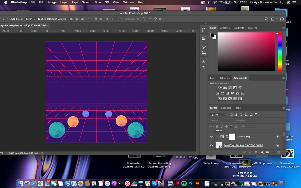
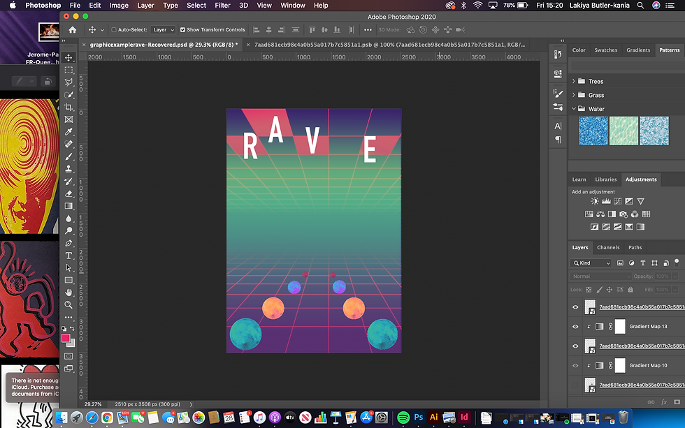
I decided that I didn't like the squares at the top so I turned the layer off. I experimented with gradient mapping all of the planets and also changing the positioning of them to make the layout more effective as I felt that the layout before was not particularly right.

I then decided the image was too wide, so I made the planets closer to each other and cropped the image.

Now that I had placed my planets, I needed to figure out how to create the gradient mix that they had created in the image I was inspired by. At first, I had difficulty trying to figure out how to do this. I experimented with the mixer brush and placing colours to mix together. This was a long and difficult process which did not prove to be very effective. I started to look at how else I could create a gradient.

I then discovered the gradient tool and placed that on a layer behind my planets but over the grid background so that the gradient would be present over the grid. I was much more pleased with the results as it created a gradient with different colours at the top and the bottom, which is what I wanted to achieve. I discovered that I had been making life a lot harder for myself by trying to achieve gradients with the paint tool.

I then experimented with different blending options over the top of the grid. Because the grid was already a colour, blending the two layers together created different colours which was interesting to experiment with as I would get results I was not expecting.

After experimenting with different gradients, here is the one I decided to use moving forward. I wanted elements of green to be in the background as green is also present in the image I am inspired by.

My next step was to re add in the squares at the top using the same method as before. I made sure to make the blocks the same colour as the lines. To create more effect, I also added a gradient in the blocks as I knew the pinks were different in the lines due to them also being a gradient.

Then, with a simple white text, I added in the lettering. I didn't want the lettering to be the exact same word as the original, therefore I used another four lettered word that was also relevant and looked close to the original. I placed these letters in the boxes just as they are in the original. I planned to cut parts out and have them merging into the blocks, inspired by the poster I was copying.
I felt the image was still too wide, therefore, I cut down the image to be even skinnier and played around with the layout of the planets again to fit the new format. I felt it was important to cut the image down as I felt there was too much space at the top next to the 'E where as in the inspired image, the words fit completely across the top with no space.
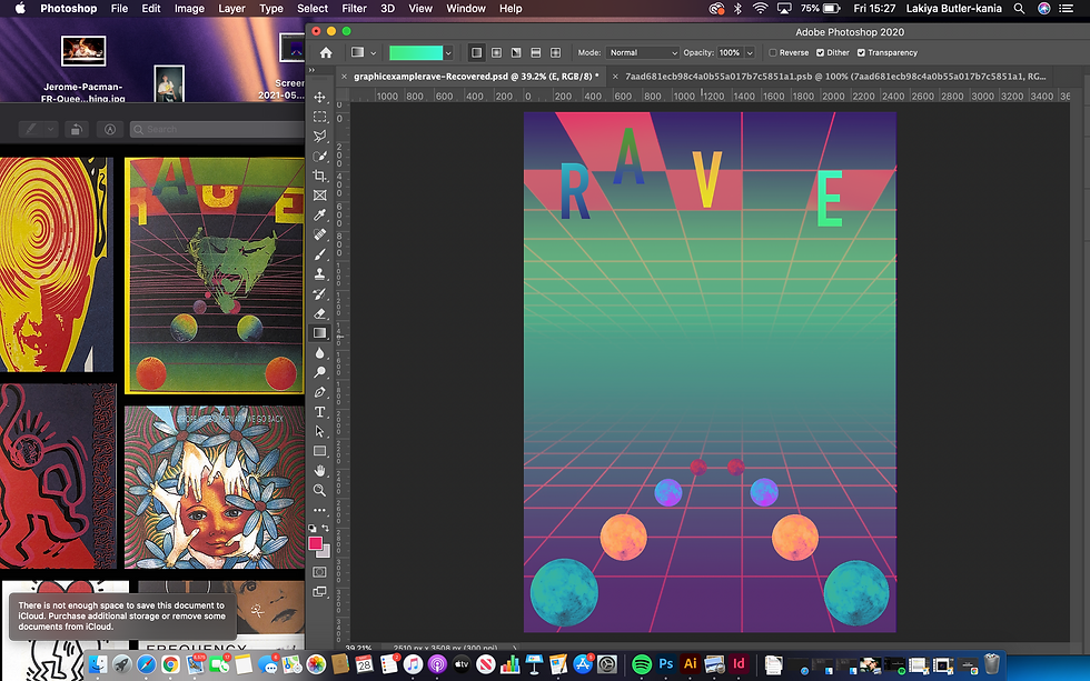
After doing that, with the same gradient tool, I created clipping masks on each letter and did different coloured gradients. I wanted the colours to be vibrant and stand out contrasting with the background, which I think I successfully did.
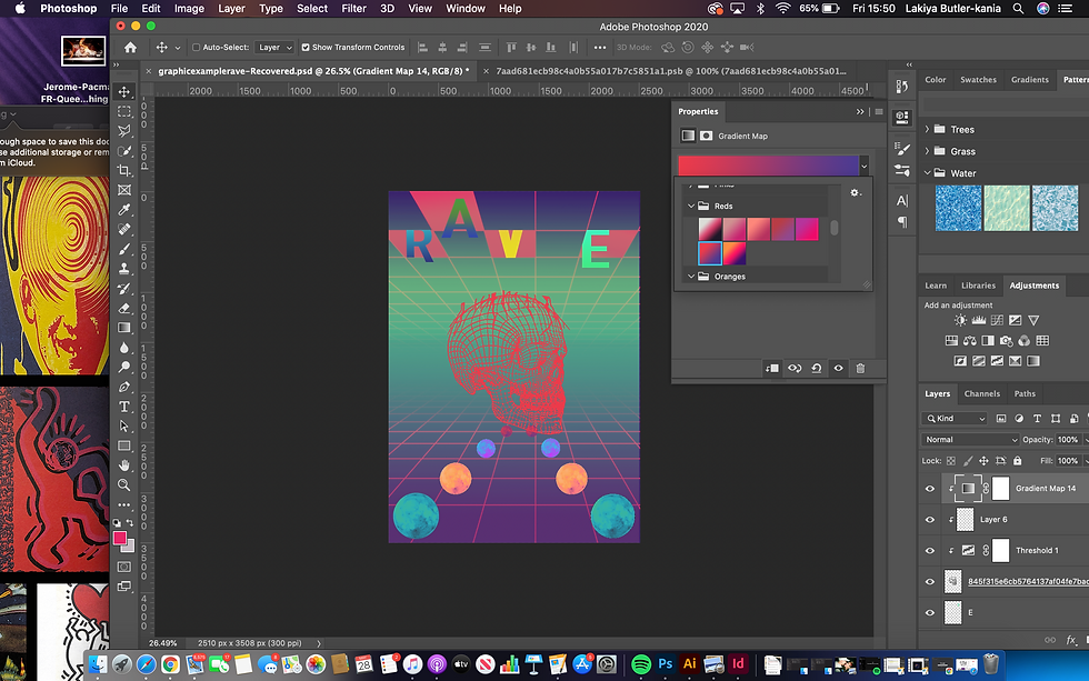
Finally, I needed to add an object in the middle. I decided that I wanted a skull in mine. To get it to look how it does, I got an image of a skull, removed the background and placed a gradient map over the skull lines to change the colour. Originally I felt that red was the best match, but then I felt like that it stood out too much.

I experimented with the skull being different colours but came to the conclusion that blue worked best.

Now that the image was completely created, I needed to add more texture to it, therefore, I placed paper overlays over it to make it look more retro and like it would be a flyer. I also added dust filters and grain to give a more old school feel.
Overall, I am pleased with the outcome of my graphic design response. I feel that you can see a clear resemblance between the two images. It was a challenging process at the start, but once I understood what to do, I found it to be quite easy. I have learned a lot from creating this poster, such as how to use gradient tools and how to easily remove backgrounds from images.


Comments