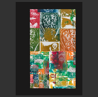
First Booklet Attempt...
- Laks

- Oct 15, 2019
- 1 min read
Updated: Feb 3, 2020
Tuesday 15th October 2019,

Today I made a test booklet including some photos and stills from videos I took in Margate.
To do this, we used a software called 'Adobe design', a software I had not used before.
Rob demonstrated to us how to play around with different features within the app to make our booklets look more interesting. We had to place images onto 16 pages saving space for text.
He taught us how to add images onto the pages, which you do through placing a box in the place you want it and then dragging the photo to that image, he also showed us how to reposition photos and make them to scale.
Then, we got taught how to change colours of the background, add text and create layers for different blocks of colours etc.
I tried to make my work simple as I feel simplicity is effective. for text, I added song lyrics of songs that I am listening to at the moment. I tried to include photos with the same or similar backgrounds and colours on each page to make the pages have a theme instead of being random, to give my booklet a cleaner feeling.
When creating my booklets for my course I will remember this tactic and use it to make my book look more professional. I am going to do some research on how to do different things to add to my final booklets to make them look better.
Although, for a first attempt I feel like I have done a good job and have learned many new skills to do again.


Comments