Altered states - Self Portrait
- Laks

- Nov 10, 2020
- 3 min read
Updated: Nov 11, 2020

For my first week, I have been experimenting with self portraits, looking at work from artists such as 'Andy Warhol', especially getting inspiration from his book of Polaroids, which he captured between 1958-1987. I wanted to capture simplistic photos, and then add layers onto the top of the photo to create a distorted look.
Originally, I experimented with Polaroids, which is the same medium Warhol used, but I found my work to not be as affective as I wanted it to be and with limited resources, I found this method not to be the most effective for what I wanted to achieve.

I tried to do a sequence between the photos taken but I was not happy with the results. Next time, I will make sure the camera is in a stable position so it does not move between photos and have a basic background to bring full attention to the portrait. I have learned from my mistakes and once I have more film, would like to try this again.
After deciding that I did not want to use the polaroids, I moved onto taking photos on my camera. I set up the camera so it was positioned right in front of me with a light over in front of a plain white background. I did this to make sure the main point of the photo was the subject. I then set a timer on the camera so that it would take a series of photos to create a sequence. I planned to move slightly in each photo to create the desired effect.

To the left is one of the raw photos taken.
After I had taken a series of photos, I exported them to my computer and sorted through to find the best ones. I found that some of the photos that I liked, weren't from the same snaps, therefore the changes between them were more noticeable, but this still looked effective.
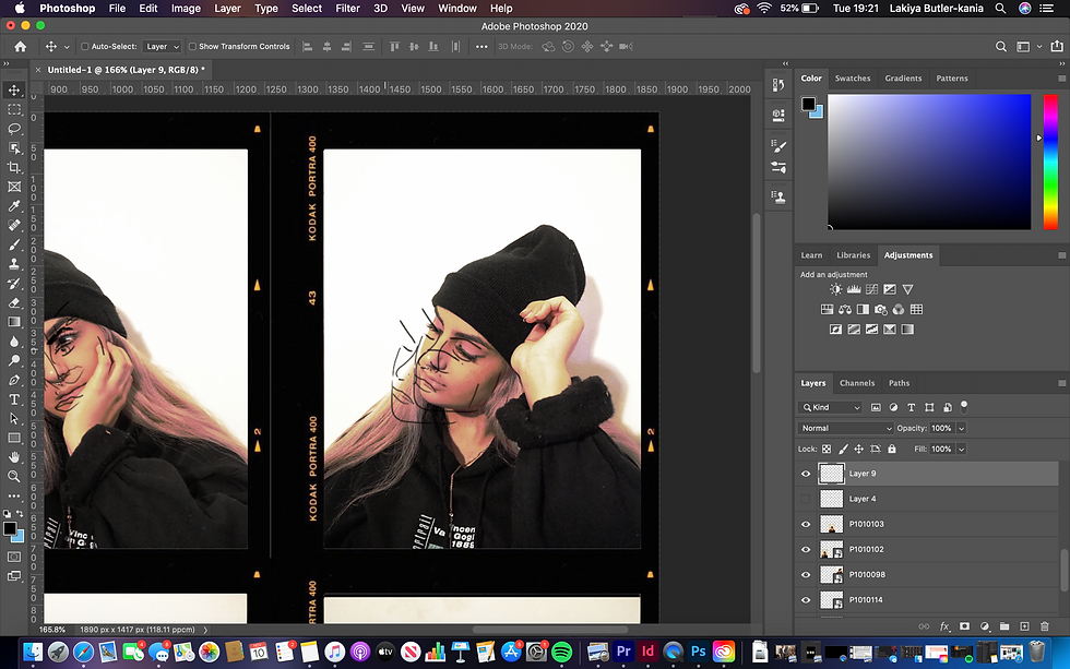
Once I had picked my photos, I went to photoshop to compose my images into a sequence. I wanted to add borders to my photos, so I went online and got the Kodak portra border and exported it into photoshop. I then removed the background and pasted 6 copies, for each photo. I did this by creating a mask.

Once I had got my borders, I then added the photos I had taken into the slots

Once I had my images, I started to think about how I could make all the images look similar. I thought about lighting, shadows and overall colours within the photos. I clicked the 'curves' icon in adjustments and started to play around with the lighting on the photos. I made sure to have the adjustment layer over all the photos so that they all had the same effects over them.

I played around with saturation etc until I had the desired filter over all the photos. I wanted the colours to be saturated but not too extreme.
Once I was satisfied with the colours of my photos, I started to think about what I could add on top to make the photo look distorted. I wanted to play around with the appearance not being completely clear as I wanted these portraits to show I am not completely comfortable with my own skin.
First, I experimented with adding coloured boxes over parts of the image, and then turning the saturation up all the way to show a distorted look, but I was not satisfied with the outcome.
Once I was certain this was not the method that I wanted to use, I started to draw over the outlines of my faces. I discovered that I liked this. I then took the outlines and shifted them slightly to the left of the face, creating a multiple effect. I then copied and pasted the outline and placed on the other side of the face, to create confusion. I found by doing this, you couldn't clearly see the face, more so just the outline of it, which I liked.

I did this over all the photos.making sure to think about layout of the drawings. I decided to keep the drawings black to make them more bold. I like how the photos turned out in the end.
Overall, I am pleased with how the photos came out, but next time I will consider many different things to create an even better final product.
First, when using polaroids, I will think more about the layout of them, and also use a much simpler background to bring more attention to the person being photographed. I will think more about the size of the subject in my image too.
Another thing I will consider next time too is making sure to only move slightly between the photos taken to create a much more sequenced looking effect. I feel like in the photos that I took there is too much difference between them, especially in the first three.


Comments